Same Great Mission
Fresh New Look
A new chapter for Family Centered Services of CT, now a Division of Bridges Healthcare
A New Look & A Shared Future
For nearly 50 years, Family Centered Services of CT has made a difference in the lives of children and families throughout Greater New Haven. In the summer of 2026, the agency unified with Bridges Healthcare, retaining our mission while creating a stronger organization dedicated to expanding and enhancing services for those we serve.
With a combined 118 years of experience and a shared commitment to serving vulnerable populations, the unification brought together two trusted organizations with deep community roots.
Together, we are strengthening access to care, expanding service offerings, and creating a more comprehensive continuum of support for individuals and families facing behavioral health and social challenges.
As part of this new chapter, Family Centered Services of CT has rebranded as Family Centered Services of CT, a Division of Bridges Healthcare.
A Logo That Honors the Past While Looking Forward
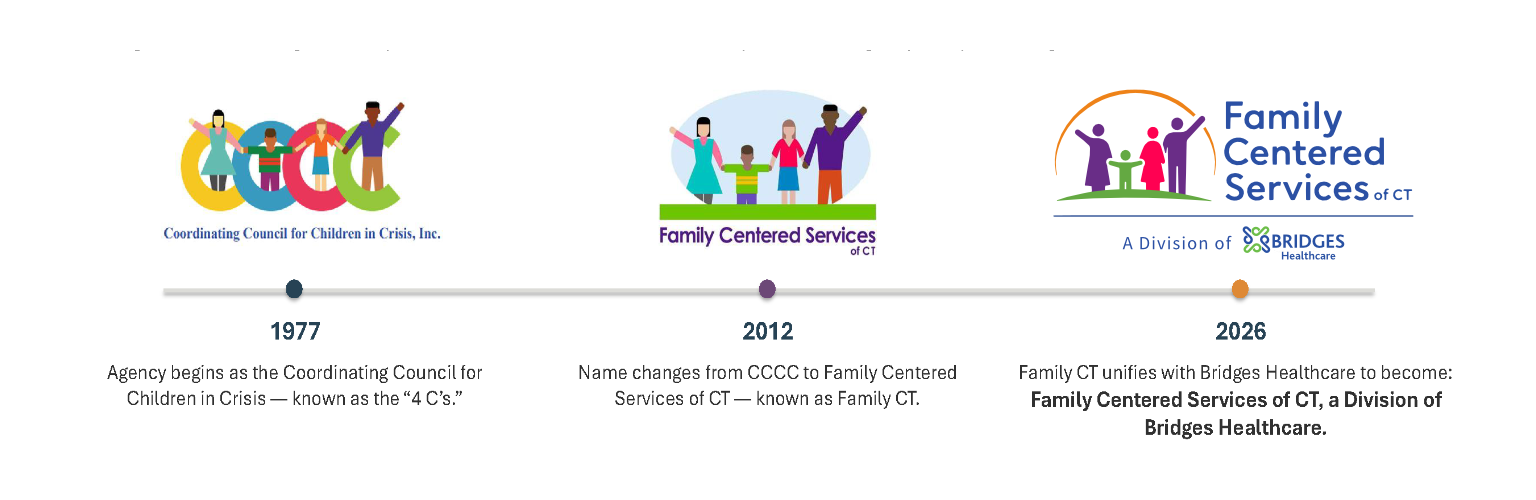
The Family Centered Services of CT Logo has evolved throughout the years.
This new look reflects the agency today as a Division of Bridges Healthcare while honoring its journey.
Our logo has evolved alongside the communities we serve. From our beginnings as the Coordinating Council for Children in Crisis to becoming Family Centered Services of CT, each chapter has reflected our commitment to children and families.
Today, our refreshed identity preserves the familiar family imagery while introducing design elements that reflect our connection to Bridges Healthcare. It honors where we've been and celebrates where we're going together.
The Meaning Behind Our Colors

Stability & Trust
Represents the dependable support, strength, and guidance that help families build strong foundations.

Growth & Renewal
Symbolizes growth, healing, and the opportunity for children and families to thrive.

Compassion & Empowerment
Symbolizes a longstanding commitment to supporting survivors of domestic violence.

Connection & Transformation
Represents momentum, encouragement, and the positive change that helps families move forward.

Hope & Possibility
Reflects warmth, optimism, and the hope that every family deserves the opportunity to succeed.
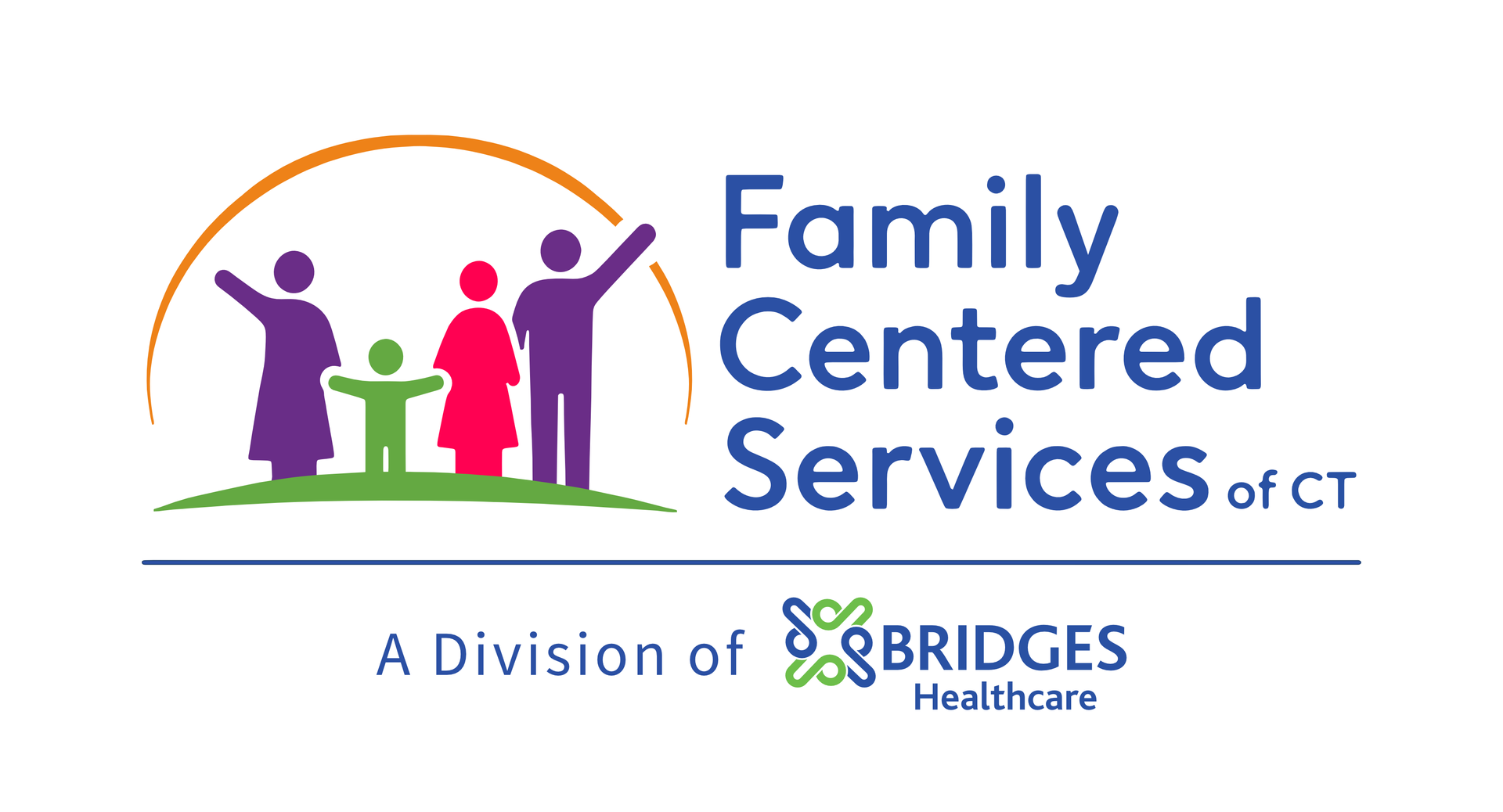
The orange arc surrounding the family symbolizes warmth, hope, and the bright future made possible through connection and community. The figures stand on a green foundation representing growth and stability.
Together, these elements reflect Family Centered Services' continued commitment to strengthening children and families while embracing its new role as a Division of Bridges Healthcare.
Designed for the Future
Our refreshed identity represents more than a new logo. It reflects Family Centered Services of CT's continued commitment to compassionate, person-centered, trauma-informed care and a shared vision with Bridges Healthcare to strengthen children, families, and communities.
As we begin this next chapter together, we invite you to discover the programs and services offered by Bridges Healthcare and the many ways we're building stronger, healthier communities.